
On Asset Resilience Maps and Forking Vinay Gupta
There is an Arab saying that goes ‘no skill to understand, mastery to write’.
Enabling complex issues to be quickly understood, particularly visually, is a rare skill and exhilarating when you come across it. Recently I have been wrestling with communicating the vulnerability of critical infrastructure in the energy sector. Sounds dry but is fascinating. The challenge has been made much easier by discovering Vinay Gupta’s work on social resilience maps. Being able to immediately map personal and social resilience transforms preparation and action on the ground in a refugee crisis national emergency.
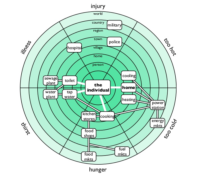
Vinay Gupta’s Resilience Map
Gupta’s work puts the individual at the centre of a survival map surrounded by the six factors that will put their life at risk, and at the 6 levels of proximity from individual to world scale – so creating the ‘dartboard of death’.
The challenge was to see if Vinay’s core insight could be used it to help with resilience planning for assets inside DNO (Distribution Network Operator) organisations that distribute electricity throughout the UK; although I hope any critical asset holder in (inter)national critical infrastructure may find it useful.
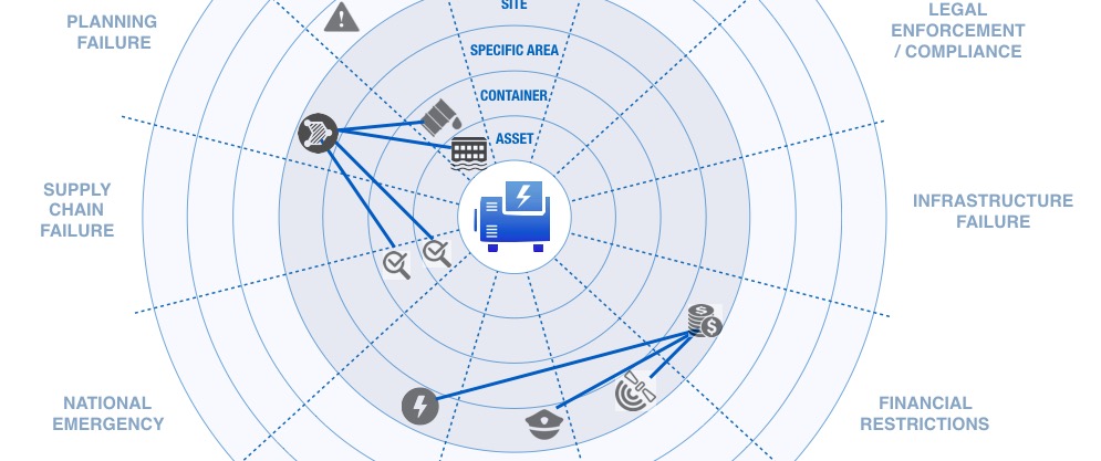
Social Resilience maps were generously created under the Creative Commons license and in GitHub parlance I have forked Vinay’s work and directed it toward the critical asset sector, still under the CC license. The ‘dartboard of death’ is now the ‘dartboard of downtime’ and there are 12 destructive forces rather than six ways to die. You can still map relationships and dependencies between actions and elements so anyone can consider what may affect critical infrastructure and ensure whatever scenario plans are made, there is a resilience.
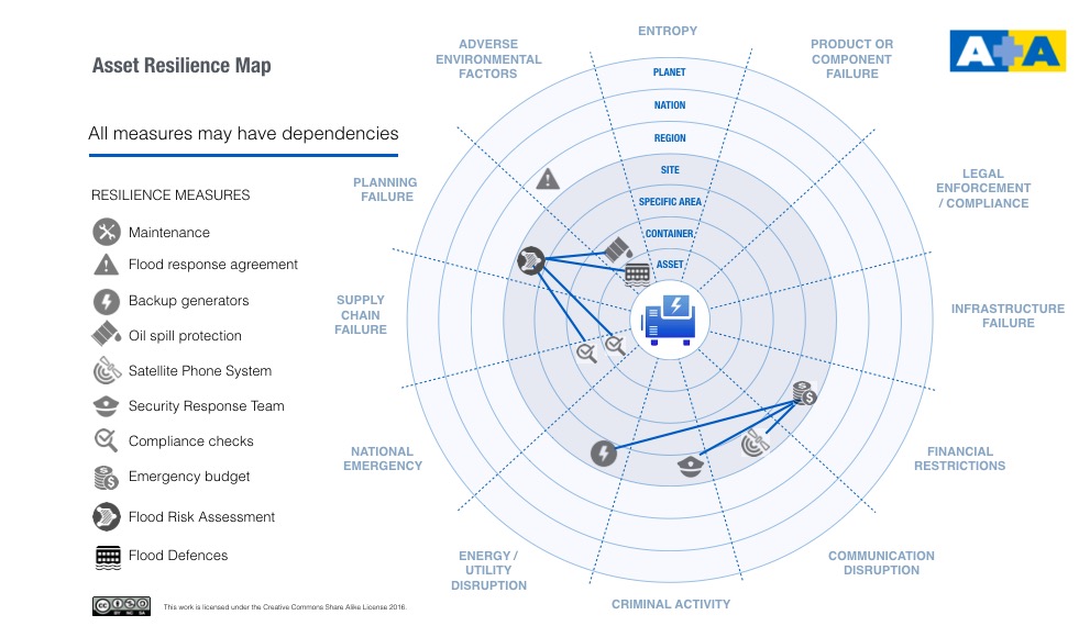
Asset Resilience Map
The image above shows a sample list of measures and we already have a large list to browse, use and add to. There is also a Creative Commons drag-and-drop web app we are building to make scenario planning easier. We will open source the code for this on GitHub in due course.
Asset Resilience goes beyond ‘operate and maintain’ thinking and embraces Asset Performance too. Unlike human beings, when an asset dies it can be brought back to life or replaced and therefore there are additional dimensions to human resilience to be considered – replacement, redundancy or fix for example.
In time we are looking to add a scoring aspect to each of the elements used on the map and therefore create values for scenarios that could be of use in insurance and health & safety planning.
The initial description doc is here, is free to download and will be updated periodically. The work is being generously supported by Adler and Allan.
Are you part of the critical energy sector or interested in mapping assets? We are forming a discussion group (admin is Emma Tilley and she can be contacted here) to round out the thinking and collaborate to improve its effectiveness, we’d love to have your views.
Image rights
Resilience map – Vinay Gupta, resiliencemaps.org